Developer Express XtraGrid .NET Suite - .NET Edition - V6.1.3
Add bound or unbound, native .NET grids to your Visual Studio.NET applications. Developer Express XtraGrid .NET Suite is a 100% C# Grid, CardView, and Editors Library built specifically for Visual Studio .NET. Optimized to take full advantage of the .NET Framework and all .NET Languages, offering everything from standard two-dimensional grids, to runtime grouping and column customization; from master/detail support, to Card Views; from 15 feature rich data editors to advanced alpha blending and custom draw. With the XtraGrid Suite, you also get full access to the C# source code.
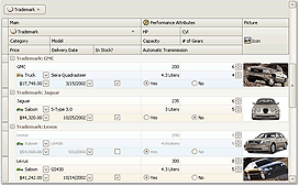
The XtraGrid Suite offers you flexible and feature rich Grid Views and Card View, along with 20 editors that can be used as either standalone or within grid cells and 16 more controls that allow you to easily build professional and consistent applications. The advanced Data Controller technology ensures the fastest data processing for any given data source and gives you total control over each data operation. The LookAndFeel technology, fast and intuitive design-time access to any object and an out-of-the-box complete user interface ensure that you will deliver more than ever in the shortest time possible.
The main benefits of the XtraGrid Suite:
Appearance Customization
The grid can be painted in 3D, Flat, UltraFlat, Office 2003 style or using the currently applied XP theme
The grid fully supports the Skins technology which means elements are constructed from a set of bitmaps. This allows you to provide an XP look and feel for any operating system. With the XtraGrid, you get 6 8 built-in skins and in addition can create your own
The previous two benefits are possible since the XtraGrid and the other included controls support a shared painting library. With this library, you have centralized control over the look and feel of all controls. You can change the paint style of all the controls by changing just a single property
Each and every element within the XtraGrid can be manually painted
The XtraGrid fully supports background images and alpha blending. It gives you a special component that manages transparency levels for elements so that you can change colors while preserving the transparency levels
View Technology
The XtraGrid provides you with four built-in views that ensure you can provide the most elegant on-screen representation for any type of data. The base views provide data presentation using the table format or expandable cards. There are two enhanced table formats one allows columns to be grouped into nested bands, the other allows you to provide multi-line cell layout.
True Master-Detail Support
You can display an unlimited number of nesting levels and branches
You can switch between neighboring details using the specially designed tab-switcher or tool tip
Details at any nesting levels can be represented by any View. E.g. you can present detail data using cards.
Views give you the full feature-set regardless of whether they are used as a master or detail view or as the only view within the grid control
End-users can zoom in on any detail so that it fills the entire control
Details can be synchronized. E.g. end-users can group data in a single detail while the rest are not affected.
Master-detail data can be supplied to the grid in numerous formats. The grid automatically recognizes relations between DataTables and expandable properties (that implement the IList interface). You can also implement the specially designed interface in a master table or supply detail data via events, thus providing dynamic detail loading which can give a performance benefit
Extremely Fast Data Processing and Visual Updates
Developer Express have made every effort to make sure their grid is as fast as possible from scrolling huge record sets to immediate layout updates and fast data sorting, grouping and filtering. They have designed this control so it can be used for any purpose without any hassles even for real-time data analysis.
Data Operations
You can group data against an unlimited number of columns. There are several built-in group styles Unique Values, Alphabetic, By Month, By Year, Outlook 2003 Style. You can also provide custom data grouping algorithms
You can provide a single group panel for the master and details or display group panels within each individual detail.
Standard and Office 2003 group row styles are available
You can sort data against an unlimited number of columns. Data can be sorted either by field values or by the display text of cells. You can also implement custom data sorting algorithms. End-users can sort data both in the Grid and Card Views
You can filter data by any criteria. There are numerous user interface elements that can be used to filter data AutoFilter row, MS Excel style filter dropdowns and dialogs, the filter panel. The Filter Panel and Filter Dropdowns have lists of the most-recently used values. End-users can filter data both in the Grid and Card Views
Grid Views can display summaries of two types a total summary which is calculated against all the values in a field and group summaries which are calculated against the values within each individual group. You can use one of the 5 built-in aggregate functions or implement your own
Data Layout
Fixed columns and bands (column groups) are allowed in Grid Views. Such columns and bands are anchored to the right or left edge of a view and arent affected by horizontal scrolling
Cell merging is available in Grid Views. Neighboring cells are joined into a single cell if they have identical values. You can provide a custom algorithm for comparing cell values
MS Outlook style Preview sections with automatic height calculation are available
Grid and Card Views can automatically calculate the height of cells for memo and image fields
Grid Views can automatically can automatically calculate the width of columns. In this mode, the total column width matches the grids width and horizontal scrolling will never be needed
Card Views offer automatic card width adjustment. In this mode you can specify how many card columns are to be displayed. Cards are automatically resized to occupy the entire view space available
Grid Views can fit their columns based upon their content
Data Editing
The XtraGrid is powered by the XtraEditors Library a feature-rich and usable editors. This library offers you 20 editors which can be embedded into grid cells
You can easily create custom editors. The XtraEditors Library includes three custom editor samples
An Integrated UI for adding and deleting records is available. You can add or delete rows using the data navigator. Grid views can display the NewItem row either as the first or last row
Centralized validation for entered data. In addition, the grid provides built-in error indication via error icons. It also automatically recognizes errors in the data source if its records implement the IDataErrorInfo interface
Data Printing and Export
The XtraGrid can be printed or exported to a graphics file with the help of the XtraPrinting Library which is a separate product
The XtraGrids data can be exported to XLS, TXT, HTML and XML formats
You can print or export each individual detail separately
End-user Experience
With the XtraGrid, you dont have to write code to allow end-users to customize Views. And whats more important, most end-user capabilities are available without having to toggle a single property.
Built-in end-user capabilities include:
Column and card field visibility customization
Reordering, resizing and applying best fit to columns
Resizing rows and cards
Grouping, sorting, filtering data and applying summaries
Full expand/collapse for group rows
Multiple row selection
Automatic hints for cells and headers with truncated values
Three convenient built-in menus
Design-time Experience
The XtraGrid gives you on-form access to all objects. You just click on column headers, card fields, bands and access their settings via the Properties window
Each view offers a convenient Property Editor dialog
The integrated Feature Browser allows you to find the desired settings with ease
The integrated Appearance Editor dialog lets you access style settings for each element by clicking the desired element
Miscellaneous
Convenient API that allows you to determine which of the grids element is located at a specified point
The XtraGrid is fully localizable
Each View allows you to save and restore its layouts via a number of storage medias



 پاسخ با نقل قول





 New releases from Cachupa


 New releases from Waymex IT Ltd


